How Customized Façade Design Maximizes Seasonal Promotions
The core strength of adaptable design is flexibility. Adaptability in retail design allows for a quick and agile implementation of strategic changes, reshaping the space with new designs in-line with the promotion and leaving long-lasting impressions of the brand and products. The elements of an adaptable retail design give the possibility to put hands back at any moment to the appearance and conformation of the space after its realization.
Goals of Adaptable Retail Design
The goal of adaptable retail design is to provide brands with the possibility to expand the reach of their seasonal promotions and effectively maximize their effects:
– Attract customers: brands can effectively engage loyal customers by reshaping an already familiar space in new ways. It also allows for implementing high-impact designs that help attract new customers.
– Provide experience: setting up temporary experiential points can expand the range of entertaining activities customers can engage in while visiting the store.
– Promote new products and designs: eye-grabbing new elements complementing the main design help focus the attention on the new lines and seasonal items.
Elements of Adaptable Retail Design
In this four-part series we are going to explore the possibilities of the main elements in adaptable retail design. The four main elements that can be easily customized in-line with the brand’s promotion are:
– Façade Design
– Interactive Experiential Points
– Product Displays
– Pop-up Stores
These four adaptable design elements enable brands to achieve key goals. While these elements can be combined, it is important to see how some brands successfully implement them separately. Part one of this series will examine how to execute façade design adaptation for seasonal promotions and new product launches.
Customized Façade Design Execution
Changes in the façade designs are often one of the first indicators for prospective customers of the brand’s new products and seasonal lines. The façade of the store has to enhance brand recognition through its best representation of the brand’s new concept and complement the main design of the store while revamping its image altogether.
A simple but effective way to signal novelty in façade design is the use of temporary window decal stickers in line with the collection promoted. While windows stickers used to be applied by lower cost retailers in the past, a number of luxury brands have adopted this customization technique in creative and exciting ways in recent years.
Gucci – Qixi Festival
For this year’s Chinese Valentine’s Day, or Qixi Festival, Gucci unveiled a new limited-edition line inspired by the English saying “Apple of my Eye.” The new design of the two interlocking GG in red print introduced an apple motif used to revamp the monogrammed accessories and apparel, but also the façade design of key locations. The stickers of the GG apples and the winged hearts covered the façade of the store two floors, with larger-sized stickers for the top floor allowing the brand to expand the promotion’s visual reach and to catch the eye of pedestrians even at a distance.

Image Source: QQ
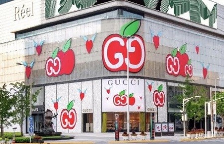
Image Source: Cunman
Dior – 2018 Autumn/Winter Collection
On occasion of their 2018 Autumn/Winter collection launch, the French brand opted for a hyper-visual and very stimulating façade design. Their collection, renamed “Youthquake”, took inspiration from the 1960s French youth cultural movements and used various slogans of the time as design elements. The collection’s new design visually translated in impactful stickers shouting the campaign slogans in large letters, as well as in a collage of black and white old-style photos and splashes of color. The vinyl decal stickers allowed the brand to present their new collection globally from avenue Montaigne in Paris to Beijing Shin Kong Place, easily adapting the concept to the façade conformation of different locations.
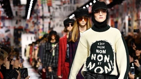
Image Source: BBC News
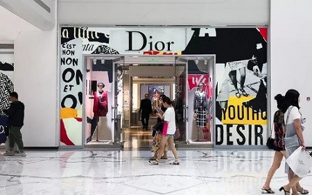
Image Source: Xuehua
Montblanc – 2020 Re-opening Campaign
For their Shanghai Grand Gateway re-opening and for stores across the country, Montblanc has adapted their global brand campaign “What Moves You Makes You” in a new monogrammed pattern in fluorescent blue. The location’s façade glass windows and glass doors are covered in decal stickers arranged in diagonal lines. The stickers thin format allows them to keep the storefront transparency, while creating a well-ordered rhythm that gives movement to the store façade. The new campaign design maintains the classic and high-end appearance of the Montblanc Maison, but also manages to successfully spin its looks and add exciting new elements.
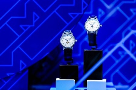
Image Source: LinkedIn
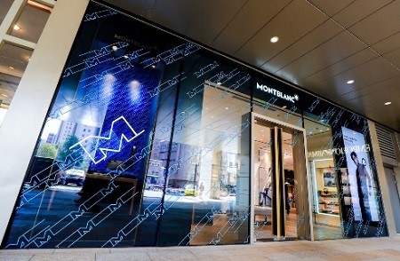
Image Source: LinkedIn
Key Benefits for Brands
Brands can benefit from customizing their storefront façade to launch seasonal promotions in three ways:
– Catch Chinese customers’ attention: the most important benefit of façade adaptation is the possibility to signal to customers that there is something new in store for them. This is particularly relevant for Chinese consumers, who expect certain special feasts and seasons to be celebrated with products specifically tailored for the occasion.
– Implement omnichannel strategy: excellent façade designs drive in-store traffic and increase online engagement with the brand. In an omnichannel promotional strategy, eye-catching decal stickers will impress customers and bring them to engage with brands also online.
– Cost-effective design adaptations: decorative elements like window stickers in vinyl are a practical and cost-effective solution to adapt the brand’s new collection concept and designs to its physical space. They allow modifying the entire façade of the store without the need for complex structural changes.
Outlook
Adaptable retail design integrates the brand’s core visual identity with exciting new elements and theme-variations on the design. Façade design adaptation provides the possibility to customize relevant elements of the storefront, like the front entrance and glass windows, without impacting or changing the main architecture.
This blog post was originally published by Melchers’ Retail Partner 5 Star Plus Retail Design, an interior design company specializing in the branded design of retail stores and restaurants. The original post can be found here.


